 |
| Image Source |
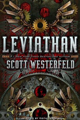
I know, I know, we aren't supposed to. But that doesn't mean we don't. I know, it sounds stupid, but the cover can really affect how I feel about the book. A while ago, I read the book Avalon High, by Meg Cabot. It was pretty good, and I enjoyed it, but while I was reading it I was almost embarrassed to carry it around. Why? The cover: It was PINK. Extremely PINK. Hot PINK. All over. And I was like "OH HELP THE PINKNESS IT'S TOO PINK MAKE IT STOP AAAAAAH MY EYES." I can't find a picture of that cover on Teh Intrawebz, which is probably a good thing, but trust me on this one, guys: It was PINK. It looked kind of like the picture at the right, but PINK. Imagine all the gold stuff being PINK, and you've got it.
 |
| Image Source |
Of course, sometimes the reverse happens: I hate a book whose cover I love. Pride and Prejudice and Zombies, by Jane Austen and Seth Grahame-Smith, has a very creative, unusual, eye-catching, nauseous-making cover that attracted me instantly. I hated the book, though, and was unable to finish it. (Maybe that was my fault, though: With a cover like that, maybe I shouldn't have been surprised that it nearly made me vomit, although it was fine until Elizabeth started killing ninjas and eating their hearts.)
But the cover is very cool, and it did its job: It made me look at the book. I think that's a cover's job: To make the book stand out. 90 % of YA books I see look exactly the same. They're black, or at least dark-coloured. There's a girl's face on the cover. And I'm all "OH look that's nice another random generic teenaged girl and I care why?" Faces on covers tend to get that reaction from me. BOR-RING. (Mother Dearest says this is because I hate people. I DO NOT!)
 |
| Image Source |
 |
| Image Source |
 |
| Image Source |
The Books of Bayern, by Shannon Hale had some lovely lovely covers. I love those cracks, that font, and those colours. They've got a beautiful fairy-tale feel. They reflect the stories very well, and they're enormously pretty to boot.
 |
| Image Source |
However, they were later replaced by a set of covers that are far more maddeningly generic and that I don't like very much at all. The last one, especially. The first one is fairly pretty if boring, and the second one has some awesome fire, but the last one I just find weird. What is with the expression on Razo's face?
That's another of my cover rules: I nearly always prefer illustration to photos. This is no exception.
 |
| Image Source |
And of course the blurbs from Stephanie Meyer do not help endear them to me, though I imagine they attract other people.
Anyway. Those are some of the covers that I loathe and love. I'd like to know what you think of them, and what your favourite/least favourite covers are.
Toodle-oo!
Haha, I just did a Harry Potter post yesterday and talked about the cover! As the saying goes, great minds think alike. :D Supposing mine is great. If not, well, then, we're just on the same wavelength and you're smarter than me. Or less insane, at any rate. ;D
ReplyDeleteLOL But anyway, this post was funny... I love your writing style. It's so RANDOM and FUN!
I love your blog posts, Zee. This one was particularly fun, too, and relevant. I hate faces on books. They keep me from imagining the characters properly. The best cover yet I've seen of character drawn on the cover is Ella Enchanted - and that cover's not even in circulation anymore (it's this one, in case you're interested: http://www.mrsmad.com/pictures/0006755488.02.MZZZZZZZ.gif The character is described exactly as she appears on the cover). Anyway. I liked the old covers for Shannon Hale, too. I really like the new covers, too, but only to gaze at as a picture. I cannot equate the covers to the characters and stuff. Nope.
ReplyDeleteAnd now they're released HP in new generic weird white-gold covers, too, which are horrible. Le sigh.
...
:D
~Lady_W
This has nothing to do with your post, but I must say that this blog is so totally wicked awesome and that I wish mine were as good as yours. xD
ReplyDeleteI totally agree, I'm not a big fan of 'Leviathan' but the cover with all of the steampunk gears is so awesome. BTW, I stumbled on your blog and I think it's awesome!
ReplyDeleteI agree. Faceless covers and nonphotographic ones are so much better, unless the photo's really treated or the face is obscured or something.
ReplyDeleteI'm not sure I could go in public carrying a book that was all pink. o.O